I was just totally committed to the cemetery photo for the cover, but so many people smarter than me explained that it’s visually “messy,” with no place for the eye to land. (It’s still inside the book, portions of it on two pages.)
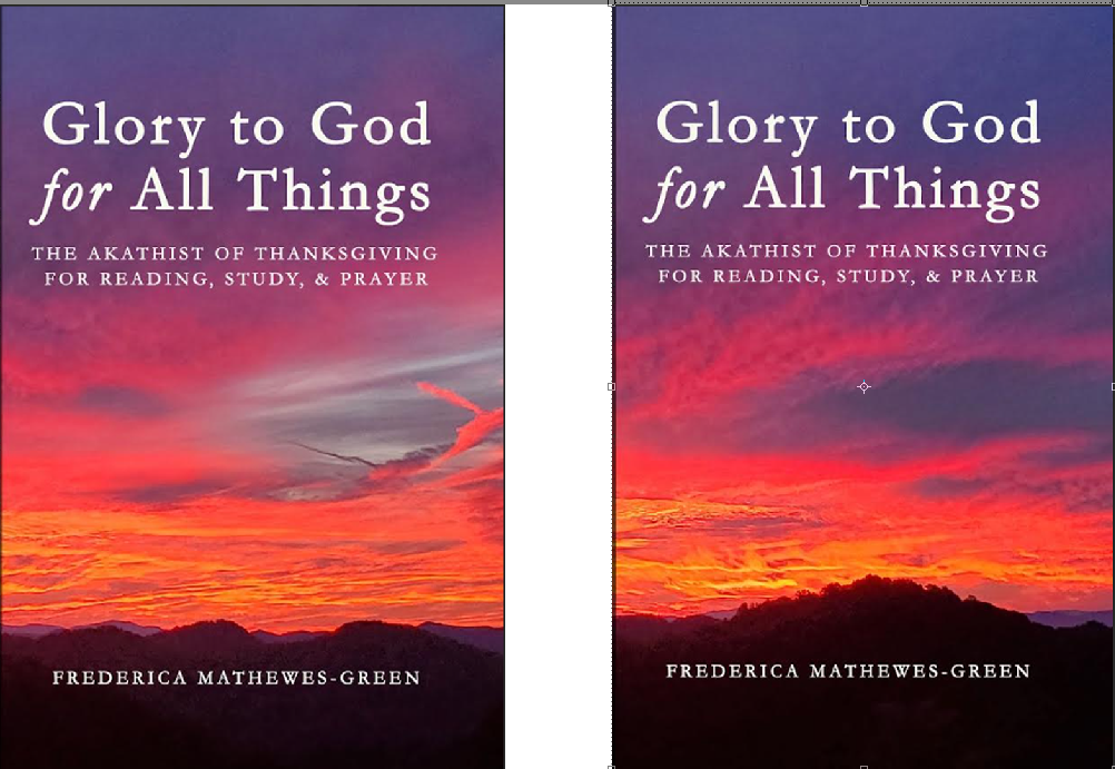
I got convinced that the sunset photo is a better choice. But do we want the side with the fuzzy cloud on the cover? Or is it just distracting, and the side with the mountain in the distance is better? The cloud-side would go on the back.
Let me know your thoughts in the comments—
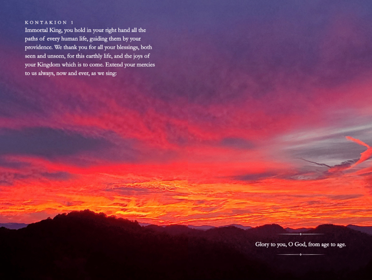
The full-spread cloud is on the inside, too, and in fact is the first big double-spread page. I think it’s perfect. Amber picked it out. I’d like to keep it, though I hope its not too weird to repeat the cover photo on the inside. At least inside you can see the whole photo uninterrupted. It’s very effective. It’s a huge “coincidence” that when I looked up the info on this photo, I learned that I took it from the church parking lot before going inside for … the Akathist of Thanksgiving, Nov. 2021.